Loading
Redesigned Poland Spring water bottle label with a minimalist, desaturated grayscale aesthetic targeting premium consumers as an alternative to Smartwater.
Basic NeedsNoticingWho to Listen ToExploreAchievement
food_drink
54 wordspositive tone
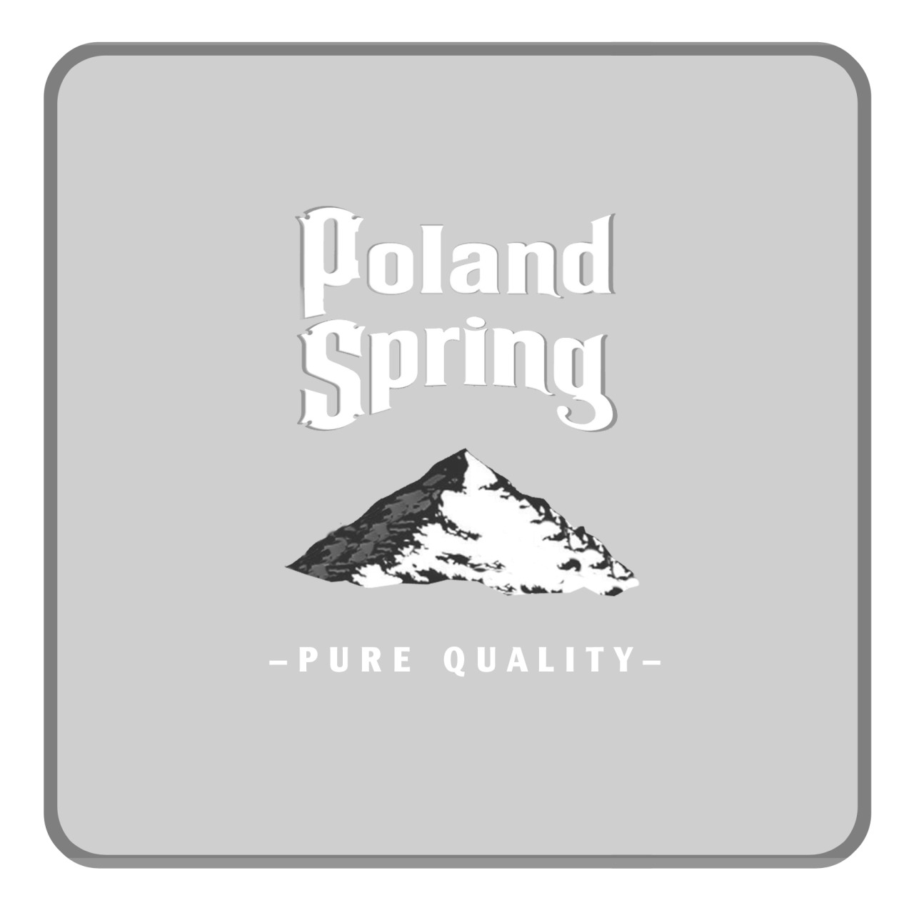
An alternative water for individuals who drink brands like Smartwater. Polar Spring provides these consumers with a “pure quality” option—simple and clean. We removed the trees and river and only kept the mountain to simplify the label. We also kept the design minimal by desaturating the fonts and background to black, grey, and white