Loading
Where Does My Tweet Go: a data visualization tool that maps the viral spread of individual tweets.
NoticingExploreAchievement
tech
73 wordspositive tone
Ever wonder how viral your tweets are? This new service graphically visualizes just that. The data visualization is really beautiful – it reminds me of the Microsoft ViralSearch video that Beth showed us in class a few weeks ago. The idea of viral is certainly desirable – being able to click through your own tweets and visualize the true audience of your words is incredible.
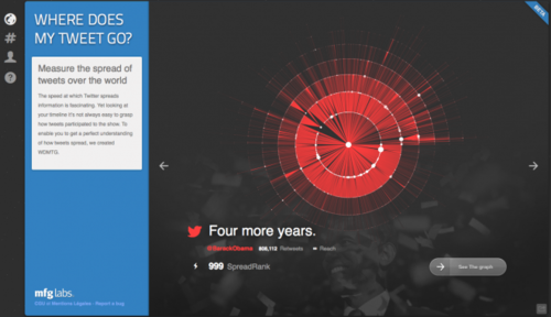
Check it out for yourself: http://wdmtg.com